Has the Expansion of American Cities Slowed Down?
Published On April 18, 2016
This piece originally appeared on the BuildZoom blog. The original post can be found here.
Key takeaways:
- As a whole, U.S. cities maintained a constant pace of outward expansion into rural territory since the 1950s, but behind the facade two groups of thriving cities are behaving very differently.
- The first group of cities substantially reduced the pace of outward expansion beginning in the 1970s, channeling its economic strength into higher property values. This group includes San Francisco, Boston, New York, Los Angeles, Seattle, San Diego, Washington, Philadelphia, Portland and Miami.
- In contrast, the second group of cities accelerated its outward expansion, channeling economic strength into greater population growth. This group includes cities like Atlanta, Austin, Charlotte, Houston and Phoenix, as well as many others.
Since World War II, America’s cities provided housing for many millions of newcomers largely by expanding into the surrounding countryside. Recently, academics, The Economist and even the White House have spewed fire at land use policies that choke off the supply of new housing. They blame the shortage of housing in certain key cities for hurting the economy because it prices people out of the most productive places, and they also tie it to other ills like reduced social mobility and damage to the environment. The historical role of cities’ outward growth in providing housing raises the question: has the expansion of American cities slowed down?
The cities that matter in this context are not the legal entities we call cities, but metropolitan areas – the broader clusters of human settlement tied together by residents’ daily routines. Although the standard definitions of U.S. metro areas are meant to capture these clusters, they are drawn along county lines and as a result include a lot of land that is, in fact, rural. Drawing an alternative boundary to distinguish rural land from developed areas is tricky because the transition between the two tends to be gradual.
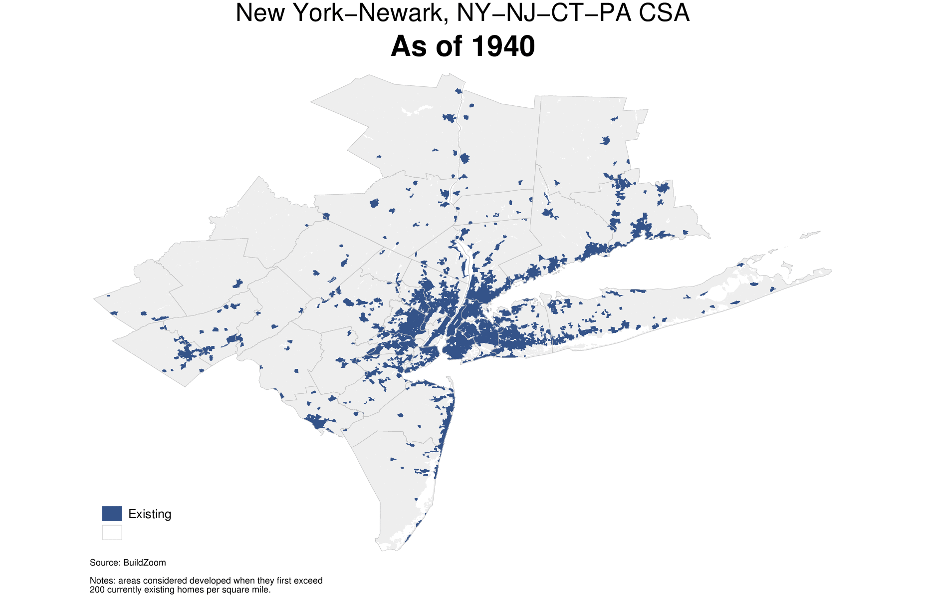
In this study, I use the age of existing residential structures, drawn from the American Community Survey, to infer the decade that areas were first developed. Areas are classified as “developed” when they first pass a density of 200 currently existing homes per square mile, which roughly marks the earliest stages of suburbanization (1). A full account of the methods used is provided in the methodology section.
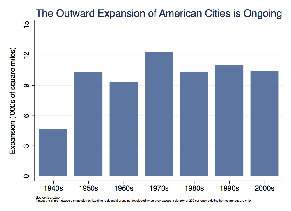
American cities are still expanding
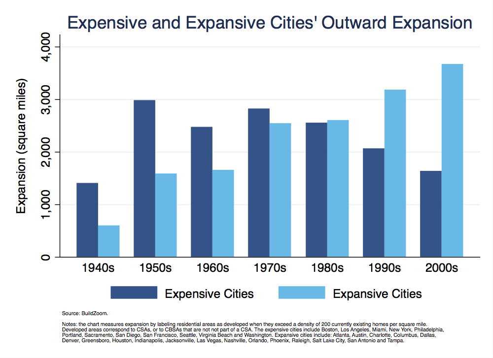
Like it or not, American cities taken as a whole are expanding just as fast as they used to. Summing up the developed area of all American cities, large and small, reveals that each decade from 1950s to the 2000s they expanded by about 10,000 square miles – an area roughly the size of Massachusetts (2). Expansion peaked in the ‘70s, but as the following chart shows, American cities maintained the same rapid clip of expansion even in the ‘90s and the 2000s (3).
Yet even though American cities as a whole are expanding just as fast as they used to, ending the inquiry here would be a pity. It is the differences between American cities’ growth patterns that make the story interesting.
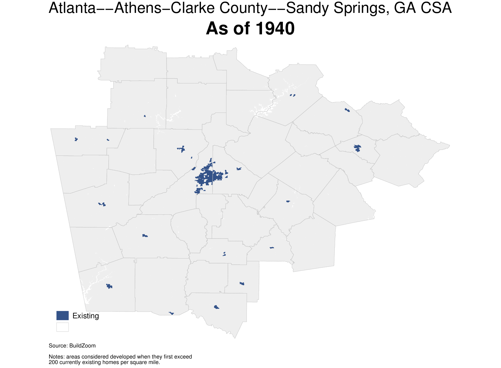
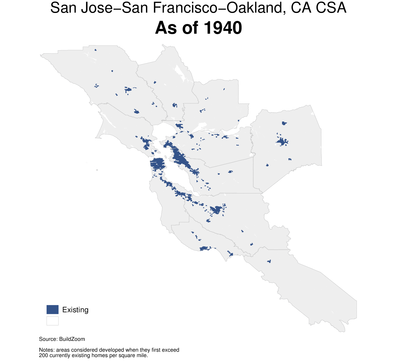
Atlanta versus San Francisco
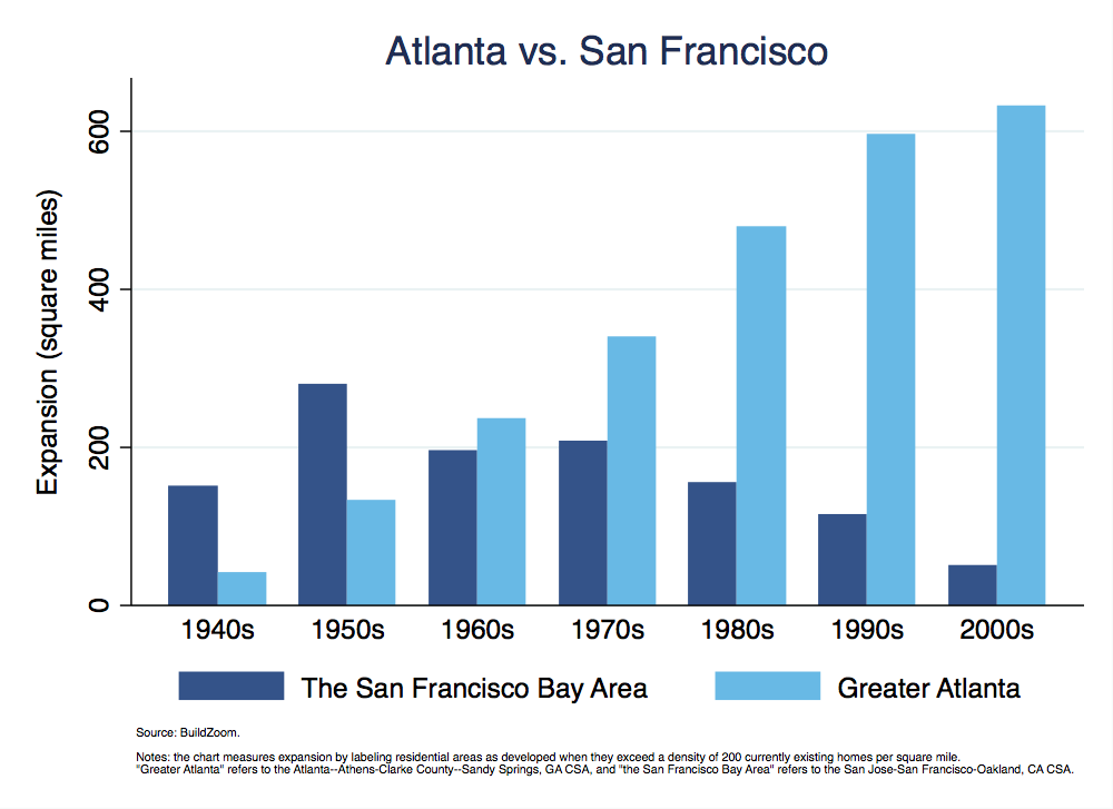
Take for example Atlanta and San Francisco – by which I mean the broadest definitions of Greater Atlanta and the San Francisco Bay Area (4). Atlanta’s developed footprint expanded considerably every decade since the 1950s – even in the 2000s, which lost several years’ of growth to the housing bust. San Francisco expanded much more than Atlanta in the ‘50s, but in contrast to Atlanta – and despite having an economy at least as strong as Atlanta’s throughout the years – San Francisco’s expansion began slowing down as early as the 1960s, and by the 2000s it had almost ground to a halt. A recent proposal to annex farmland to a suburb on San Francisco’s southern edge was described by analysts as “reminiscent of a bygone era.”
Expensive cities and expansive cities
The contrast between Atlanta and San Francisco is stark, but it is not unique. It illustrates a growing divergence between two groups of cities that began emerging broadly in the 1970s.
The Bay Area belongs to a group of cities in which a strong economy coincides with a constrained supply of housing. Economists refer to the latter condition as an inelastic supply of housing, which means that developers respond to rising property values by building only a disproportionately small number of new homes. The failure of rising prices to spur new construction stems from a combination of natural geography and land use policy. Water bodies and unwieldy slopes hem in the city, leaving fewer suitable parcels for development, and an historical accumulation of land use policies impedes both densification within the city’s existing footprint and its outward expansion.
These cities are expensive because their economies generate strong demand for housing, which meets with restricted supply. In other words, they create jobs and opportunities that attract many people, but when these people compete with each other over a limited housing stock the highest bidders prevail, raising home values and rents. A key implication of housing cost escalation is that it sorts people into and out of these cities based on their financial ability, churning out a population that is increasingly well off. Because affluent residents tend to ratchet up land use regulation more than others, the process results in an even more constrained housing supply that raises property values further in a vicious cycle.
Atlanta belongs to another group of cities with strong economies that, unlike the previous group, has produced ample new housing, largely by expanding outward. In contrast to the group of expensive cities to which the Bay Area belongs, I call this group the expansive cities, with an a. The expansive cities’ housing supply is elastic, meaning that developers respond even to minor increases in property values by building a large number of new homes. Expansive cities are often located on plains or rolling hills that do not encumber development, and compared to the expensive cities – with an e – their land use policies tend to be less restrictive and to offer fewer opportunities for opponents to quash development.
The economies of expansive cities generate strong demand for housing as well, but the unencumbered nature of their housing supply keeps home prices pegged to the cost of construction, and instead channels economic strength into greater population growth. Newcomers to expansive cities are often the very same people who were priced out of expensive ones.
A classification of American cities
The following chart plots housing price growth against outward expansion from 1980 to 2010 for the 40 largest U.S. cities, and helps classify them as expensive or expansive (5).
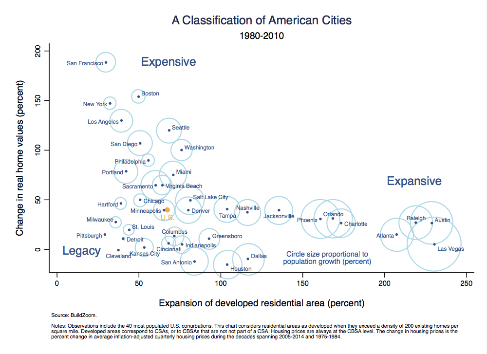
How does one read the chart? In most cases, the farther a city is from the origin the more its demand for housing has grown. Cities along the tail on the lower right are expansive, whereas cities situated toward the upper left are expensive. Those situated along the stump jutting to the lower left belong to a third category, which I call legacy cities.
Legacy cities are cities whose economies are in decline and whose demand for housing has therefore not grown. As a result, they experienced neither much housing price growth nor much expansion.
The size of the circle around a city corresponds to its population growth (in percentage terms), so it is no coincidence that the circles tend to be larger around expansive cities than expensive ones. Expensive cities gained population as well, but they did so despite the constraints on housing supply, and in the absence of such constraints their population would have grown much more. Legacy cities’ populations grew only slightly or even decreased, as indicated by the absence of a circle.
The chart shows that, with the exception of legacy cities, housing price growth is inversely related to cities’ outward expansion. At least three things are driving the relationship:
- Massive amounts of housing were built on rural land in expansive cities and helped keep housing prices there in check, whereas the restricted outward expansion of expensive cities limited their supply of housing and contributing to housing price growth. Even though correlation alone does not imply causation, there should be no doubt that cities’ degree of outward expansion affected their housing prices directly.
- Land use policy impeding densification – as opposed to expansion – is likely to be stricter in the same cities whose outward growth is curbed, and such impediments to densification contributed to housing price growth as well.
- Recall that housing price growth sets in motion a sorting process that yields a more affluent population, which is prone to tightening land use regulation. This process means that housing price growth can indirectly cause cities to expand more modestly, which once again contributes to the relationship in the chart.
Geography and land use policy
Albert Saiz of the MIT Center for Real Estate has conducted the most comprehensive research to date on land use constraints imposed by geography and regulation. He finds that both factors play an important role in restricting the housing supply, but that geography ultimately takes the front seat. Moreover, the importance of geography increases as cities grow larger, because in the process they exhaust the best tracts of land first. The importance of land use policy also increases as cities grow larger, and although Saiz does not go this far, a possible explanation is that in larger cities the cycle of restricted housing supply raising housing prices and in turn generating further land use regulation has had more time and scope to operate.
San Francisco’s extreme position at the expensive end of the chart stems from the combination of Silicon Valley’s economic might with the city’s confining natural geography on one hand, and its residents’ environmental zeal on the other. The latter shows up in both local and state-level land use regulation, as well as in residents’ propensity to take advantage of that regulation to impede development. The California Environmental Quality Act (CEQA), for example, is a well-intentioned law that is notorious for its abuse by opponents of development and others. Another example of land use policy that overtly targets urban expansion is California’s Williamson Act, which offers tax benefits to rural landowners who agree not to develop their land for ten years.
Los Angeles and Seattle are also surrounded by geographic obstacles to expansion, like San Francisco, and so is Miami which is trapped between the Atlantic Ocean and the Everglades. Although Los Angeles and Miami are not known for sharing San Francisco’s environmental sentiment, Seattle is, and Los Angeles shares the same state law as San Francisco.
The role of geography is less prominent in other expensive cities like Boston, New York, Philadelphia and Washington, aside from their proximity to the ocean. As a result, it easier to shift the blame for restricted housing supply in these cities a step further towards land use policy. In these cities and elsewhere, such policy shows up in the form of numerous mundane, local rules, like zoning for single family homes and minimum parking requirements. It also shows up in the form of stricter qualifications for the approval of new projects, e.g. placing the fate of projects in the hands of hyper-local authorities which are less attuned – to put it mildly – to cities’ broad regional housing needs.
Construction costs, neighborhood and oil booms
The expansive cities grew dramatically over the thirty year period in the chart, with many of them doubling and some even tripling their developed footprint. The expansive cities also experienced real housing price growth over the period – just not as much as the expensive ones. With the exception of Houston, Dallas and San Antonio – more on those cities in a moment – the expansive cities’ real housing price growth ranged from zero in places like Las Vegas to forty and even fifty percent in places like Denver and Salt Lake City.
The rule of thumb is that when housing supply is unrestricted then housing prices will remain near construction cost, yet real construction costs increased just over ten percent nationally during the period (6). There can be several reasons why housing price growth exceeded the construction cost growth in some of the expansive cities. The obvious one is that even among the expansive cities, housing supply is not perfectly unrestricted across the board. Another possibility is that increasing home values reflect an increase in the quality of homes for which housing price indices do not account (many facets of home quality are unobservable in the data that underpin housing price indices).
Perhaps the most interesting explanation, though, is that the distinction between expensive and expansive applies on an intra-metropolitan scale, too. Neighborhoods with more affluent residents tend to restrict the local housing supply more – by preventing densification – thereby raising property values. If the emergence of such neighborhoods modestly raises a whole city’s housing price level, it could help explain the modest housing price growth seen in some expansive cities.
Finally, the chart is not immune to temporary events like the Texas oil boom of the late 1970s and early ‘80s, which caused housing prices in Houston, Dallas and San Antonio to peak just after 1980. These cities’ slightly negative housing price growth in the chart is a figment of their unusually elevated housing prices circa 1980.
Among the top 40 cities, Minneapolis can pride itself in having the closest expansion and housing price growth numbers to urban America as a whole. Chicago, less expansive than Minneapolis, is situated at the intersection of expensive and legacy cities. The city’s location in the chart evokes the statement that it is “better understood in thirds – one-third San Francisco, two-thirds Detroit.” Note that Detroit has a tiny ring around it, which means that despite the implosion at its heart the city’s population did, in fact, grow slightly over the period. Such growth almost surely reflects the state of affairs in the suburbs.
Expansion data for all U.S. cities, large and small, are available for download here.
The heart of the story
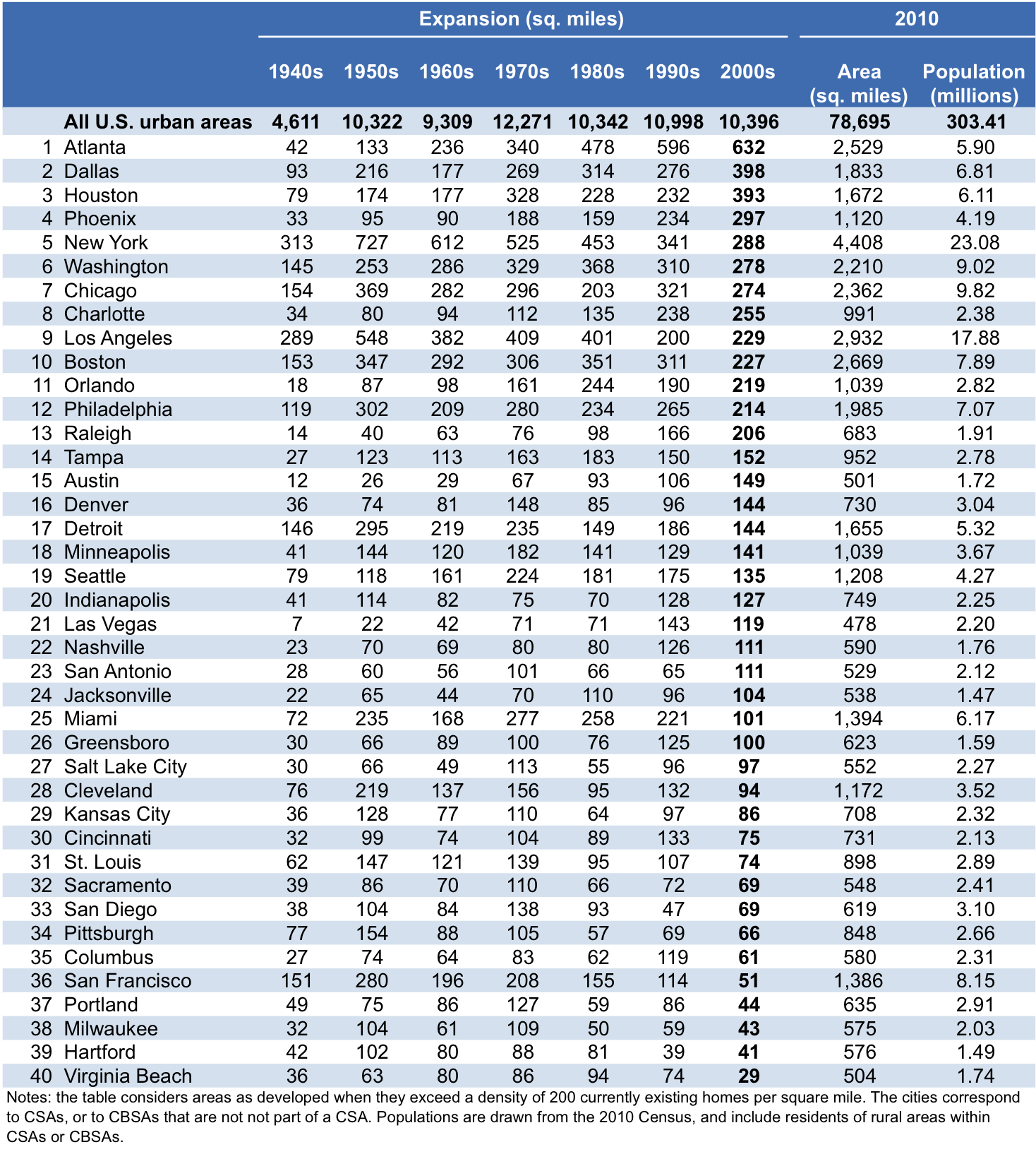
The table above shows the decade by decade expansion of the 40 largest U.S. cities and ranks them by their expansion in the 2000s.
The reason for choosing Atlanta as the poster child for expansive cities should now be clear – it was by far the greatest expander of the 2000s, the ‘90s and even the ‘80s. Indeed, four of the top five greatest expanders in the 2000s are expansive cities: Atlanta, Dallas, Houston and Phoenix. But the fifth largest expander is New York and in fact, depending on whether Chicago is considered an expensive city or not, either four or five of the top ten largest expanders in the 2000s were expensive cities. Clearly the expensive cities – with an e – are still expanding, too, and because they are generally larger, their growth is more prominent when it’s stated in square miles than in percentage terms, but this brings us back to the heart of the story.
The example of San Francisco and Atlanta is borne out nationally by the distinct trends of expensive and expansive groups of cities: since the 1970s, outward expansion has sped up in expansive cities, whereas in expensive cities it has slowed down.
The expansive cities are emerging players in the national arena. They may have incorporated long ago, but the bulk of their material presence is much more recent, and their economic importance is rising. The mass of people and companies priced out of expensive cities end up fueling the growth of expansive ones.
A likely scenario is that as expansive cities continue to grow larger and wealthier, they will gradually accrete their own set of restrictive land use policies. As this happens, the circumstances in expensive cities today may become more commonplace throughout the country.
Another possibility, though less likely, is that expensive cities will find ways of producing sufficient amounts of new housing to keep property values in check, as espoused by academics, the Economist and the White House. Such growth could occur through densification, renewed outward expansion, or a mixture of both. Even if land use regulation were reformed in favor of densification, densification involves real challenges that render it more costly than expansion, so it would be less effective at curbing housing price growth. At the same time, there are good reasons to resist a renewed drive for expansion.
Yet another potential scenario is that over the coming decades, self-driving vehicles will dramatically change land use as we know it. As I wrote several years ago, self-driving vehicles are likely to make development feasible at much greater distances from the city center than today, but they will also uncouple buildings from parking, freeing up valuable land for densification
What scenario will come to bear? Only time will tell.
Methodology:
- Definition of cities: cities in the study are defined using current White House Office of Management and Budget (OMB) definitions for Combined Statistical Areas (CSAs) and Core-Based Statistical Areas (CBSAs). CBSAs are defined along county lines and each CBSA consists of one or more counties. CSAs are clusters of contiguous CBSAs, so every CSAs consists of multiple constituent CBSAs, e.g. the San Francisco-Oakland-Hayward, CA CBSA and the San Jose-Sunnyvale-Santa Clara, CA CBSA jointly comprise the San Jose-San Francisco-Oakland, CA CSA. However, some CBSAs do not fall within a CSA, e.g. the San Diego-Carlsbad, CA CBSA. The cities in this study consist of all CSAs and, in addition, all CBSAs that do not fall within a CSA (the latter include both metropolitan and micropolitan statistical areas).
- Determination of an area’s vintage: the decade in which an area was first developed, referred to as its vintage, is determined at the Census block-group level. Data on the estimated number of currently existing housing units in each block group, broken down by decade built, is obtained from the 2010-2014 5-year American Community Survey (ACS) summary files. Data on the land area of each block group is obtained from the 2014 Census TIGER shapefiles. The cumulative number of existing housing units built in a block group until a given decade is divided by the block group’s land area to obtain an estimate of its housing density as of that decade. Finally, the decade in which the density of currently existing housing units first exceeds 200 units per square mile is taken to be the block-group’s vintage. The estimate is biased downward for three reasons. First, developed areas’ whose use is predominantly non-residential may fail to exceed the density threshold when they are first developed, e.g. using this method airports often fail to show up as developed altogether. Second, inasmuch as housing units built in the past have been demolished and not rebuilt within the same decade, the housing density indicated by currently existing housing units for a past decade may fall short of the unobserved housing density indicated by the number housing units existing at the time. Third, the estimate may be biased downward in block groups whose current housing density is low. The reason is that less densely populated block groups tend to be larger, which means that areas whose current housing density is low are likely to be carved up into less granular plots of land, and therefore more likely to include some rural territory that lowers their calculated density. Inasmuch as such a granularity bias is present, it will tend to shift areas’ vintage estimates to be later than they would be otherwise, however we suspect that the implications of the potential granularity bias are minor. All in all, the three sources of downward bias may cause areas to show up as having been built later than they actually were, but not earlier, which means than any observation of a city’s expansion slowing down is not because of the flaw but despite it.
- Estimation of cities’ land area by vintage: a city’s land area as of a given decade is determined by summing the area of its constituent Census blocks – not block groups – when they satisfy two conditions. First, their vintage must be equal to or older than the given decade. Second, the blocks must be defined by the Census as part of an urban area, as per the Census’ current definition of urban areas. A brief description of the current definition is available here, and comprehensive details are available here. As a result, in block groups containing a mixture of urban and rural blocks, only the land area of the urban blocks counts towards the city’s area. The definition of urban areas involves subjective judgment and has varied substantially over time. As a result, an alternative estimate of cities’ areas obtained as the sum of (one or more) whole constituent urban areas would be subject to inconsistent definitions across time periods, whose effect would be difficult to distinguish from actual changes in area.
- Mapping: mapping is performed at the Census block level, using 2014 Census TIGER shapefiles. In block groups containing a mixture of urban and rural blocks, only the land area of the urban blocks is mapped as developed as of the decade corresponding to the block group’s vintage.
- Population: each city’s population as of a given decade is taken as the sum of its constituent counties’ populations. Thus, the population and changes thereof include people living in the rural portion of the counties comprising each city. County population estimates for 1940 through 1990 were obtained from a National Bureau of Economic Research (NBER) compilation, available here, and for 2000 and 2010 from the Census’ American FactFinder.
- Housing price growth: housing price growth is derived from quarterly, non-seasonally adjusted Federal Housing Finance Agency (FHFA) housing price indices for all transactions, available via the St. Louis Federal Reserve’s FRED portal. The indices were adjusted for inflation using the consumer price index for all urban consumers and for all items less shelter, also obtained from the portal. The indices are available from 1975 onwards. To obtain a long-run view of housing prices that is not overly driven by transitory factors, e.g. the extent of fluctuation during the 2000s boom and bust, housing price growth is taken as the percent change in the ten year average of the inflation-adjusted indices during the decade from 2005 to 2014 and similarly during the decade from 1975 to 1984. The FHFA indices are available for CBSAs, but not for CSAs. For each CSA, the study uses the CBSA-level index for the “main” CBSA, as indicated by the informal name used to refer to the CSA in the study. For example, the housing price index used for San Francisco, i.e. the San Jose-San Francisco-Oakland, CA CSA, is the housing price index for the San Francisco-Oakland-Hayward, CA CBSA, as indicated by the informal reference to the CSA as San Francisco, rather than San Jose. The substitution of a CBSA-level index for a CSA-level one is an approximation which we believe is innocuous.
For more information and detailed maps, please visit the original post here.
(1) To get a sense of what this density means on the ground, recall that a square mile contains 640 acres, so that 200 homes per square mile amount to 3.2 acres per home on average. Of course, the acreage includes land outside of residential lots, such as land used for transportation, parks and open areas, so average lot size in at this density is substantially less than 3.2 acres. Such areas may still feel rural, but the feeling is an illusion. At this density most residents work in nearby urban areas, which means that it marks an early stage of suburbanization. Moreover, a housing density of 200 homes per square mile roughly corresponds to a population density of 500 residents per square mile, which is currently used by the Census as a baseline for identifying the outer fringe of urban areas, before adding areas with even lower population density based on subjective judgment. Note that the Census definition of urban areas’ boundaries does not lend itself to a consistent comparison of cities’ land area over time because it has varied substantially over the decades.
(2) The sum includes the areas of all metro areas defined by the White House Office of Management and Budget (OMB), including both metropolitan and micropolitan statistical areas.
(3) In percentage terms, American cities’ recent expansion is much slower than it was in the post-war period, but converting the numbers into percentage terms does not lessen the square mileage of rural land that was developed in the more recent decades. Moreover, expansion in percentage terms during the post-war period was high largely because of the compact nature of most pre-war development.
(4) More accurately, “Atlanta” refers to the Atlanta–Athens-Clarke County–Sandy Springs, GA CSA, and “San Francisco” refers to the San Jose-San Francisco-Oakland, CA CSA.
(5) 1980 was selected as the baseline year for chart because it is the earliest decade-cutoff year in which Metropolitan housing price indices are available (the expansion of residential development is observed only at decade cutoffs). It is also a convenient baseline, because large disparities in housing price trends across metropolitan areas only emerged in the 1970s and ‘80s (see Figure 1 and the description on page 2, here). To obtain a long-run view of housing prices that is not overly driven by transitory factors, e.g. the extent of fluctuation during the 2000s boom and bust, housing prices growth is taken as the percent change in the ten year average of housing price levels. See methodology section for additional details.
(6) This figure comes from comparing the growth of the RS Means national construction cost index to the the national rate of inflation (net of shelter) from 1980 to 2010.
Share This Post:
Related Articles
Student Capstone Projects
As part of our commitment to the education and professional development of UC Berkeley students, the Terner Center highlights exceptional…
Lessons from California’s Statewide Efforts to Affirmatively Further Fair Housing
To counter the impacts of decades of discriminatory housing policies and worsening racial segregation, the State of California established a number of Affirmatively Furthering Fair Housing (AFFH) strategies. Designed to foster racially and economically inclusive, opportunity-rich communities, these efforts were intended to facilitate effective local fair housing planning and enacting statewide policies to promote integrated communities. A new Terner Center policy brief highlights key AFFH strategies, noting areas of progress and where additional efforts are needed. It examines California’s successes and challenges since 2016, offering recommendations for other states working toward fair housing goals.

Addressing the Housing Needs of Low-Income Households in the Bay Area: The Importance of Public Funding
This policy brief explores how public funding can address the San Francisco Bay Area's housing affordability crisis by increasing the…
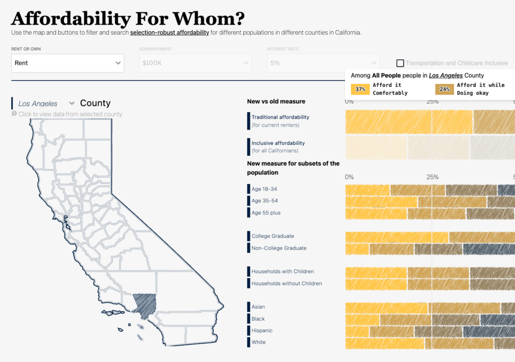
Affordability for Whom? Introducing an Inclusive Affordability Measure
This paper presents a new approach to measuring housing affordability—one that seeks to provide a better indicator of what counties…